Project Background
EPA or Environmental Protection Agency is an independent agency of U.S government that defines its mission to
“protect human health and the environment.”
This organization, with an estimated budget of $8.1 billion annually, follows its goal and mission through setting guidelines and regulations, researching and funding studies on environmental topics and also Environmental Education.
In this study, me and my peers focused on one of the methods that EPA utilizes to educate the public and raise public awareness. This method happens to be the agency’s main website.
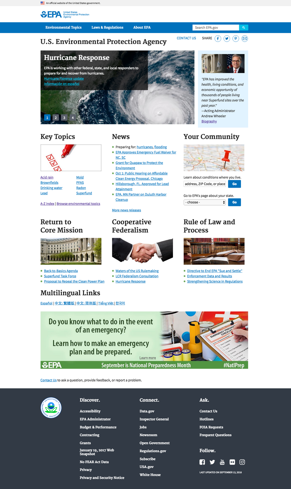
While the current website seems to have been keeping up with some of practices of creating a user friendly interface, such as making the site “responsive”, it still does not stand out as a well thought out package.
Our Research
In an attempt to make EPA’s website more user friendly and appealing we set out to conduct a small survey within a closed group of users to gather data to determine strengths and pain points of the users while interacting with the said website.
Users were asked to find information about a predetermined topic. This allowed our research group to gain insights into the 5 key metrics:
- Time spent on Task
- How many steps to complete Task
- Task completion rate
- User error rate.
- User satisfaction
By analyzing and breaking down the results of our research we determined that while users found the content of the website extensive and reliable, they found:
“the aesthetic of the platform “dated”, and the process to pinpoint the information cumbersome and taxing due to numerous redundancies.”
Problem Statement
Based on our initial studies of EPA’s website and data gathered in our research we came to the conclusion that despite the extensive content the website lacks a cohesive structure that makes navigating and pinpointing the information needed difficult for the use.
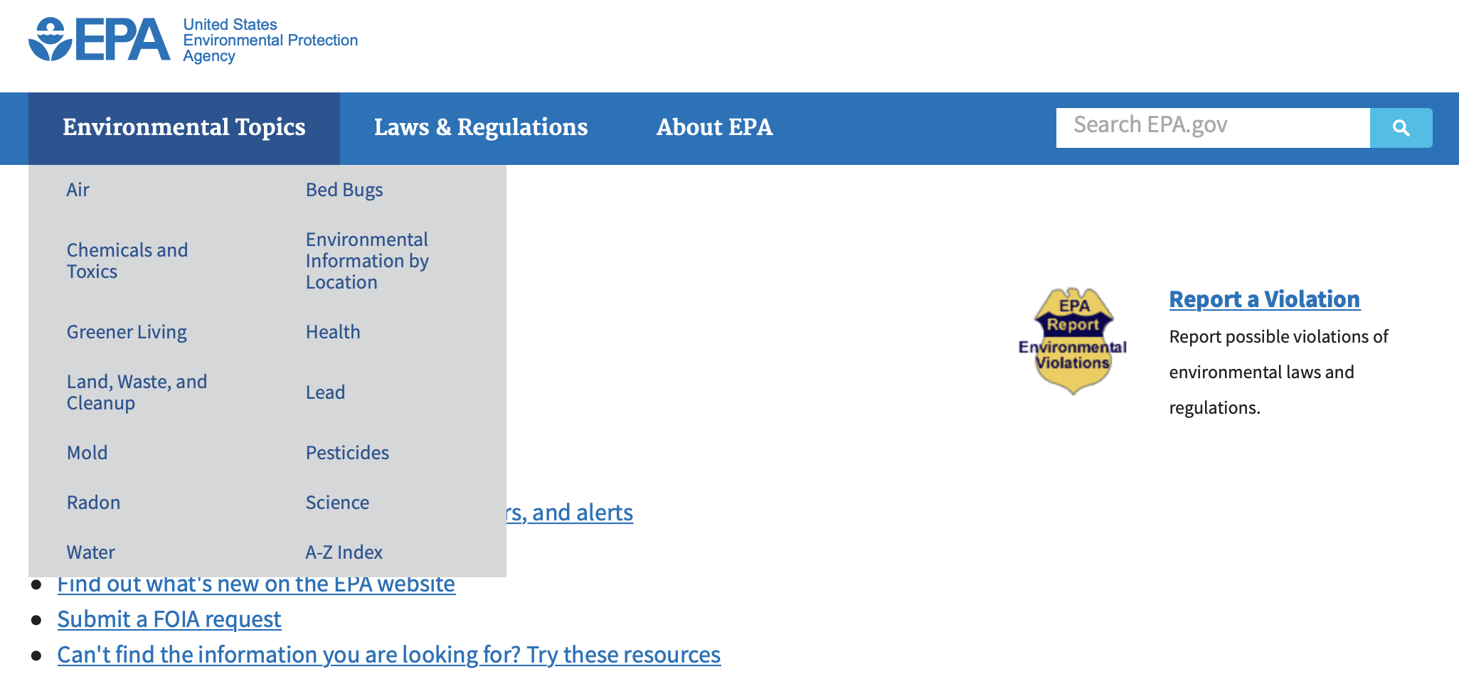
We hypothesize that the lack of hierarchy within the structuring of the content, presence of redundant hyperlinks, the conservative/cluttered design of the website and finally the absence of properly positioned CTAs have made managed to leave the user confused and made the overall experience on EPA’s website, disappointing.
Our Solution
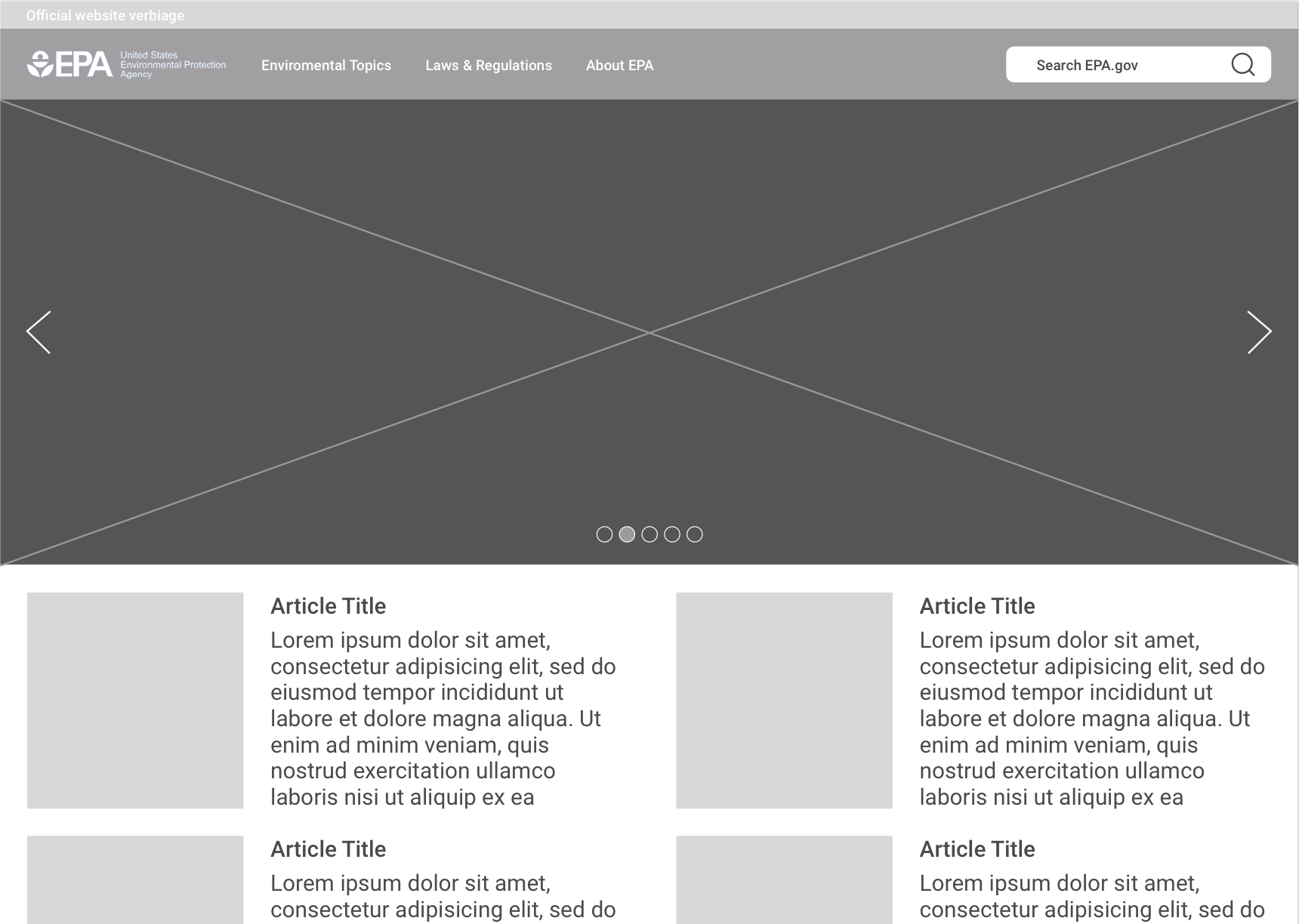
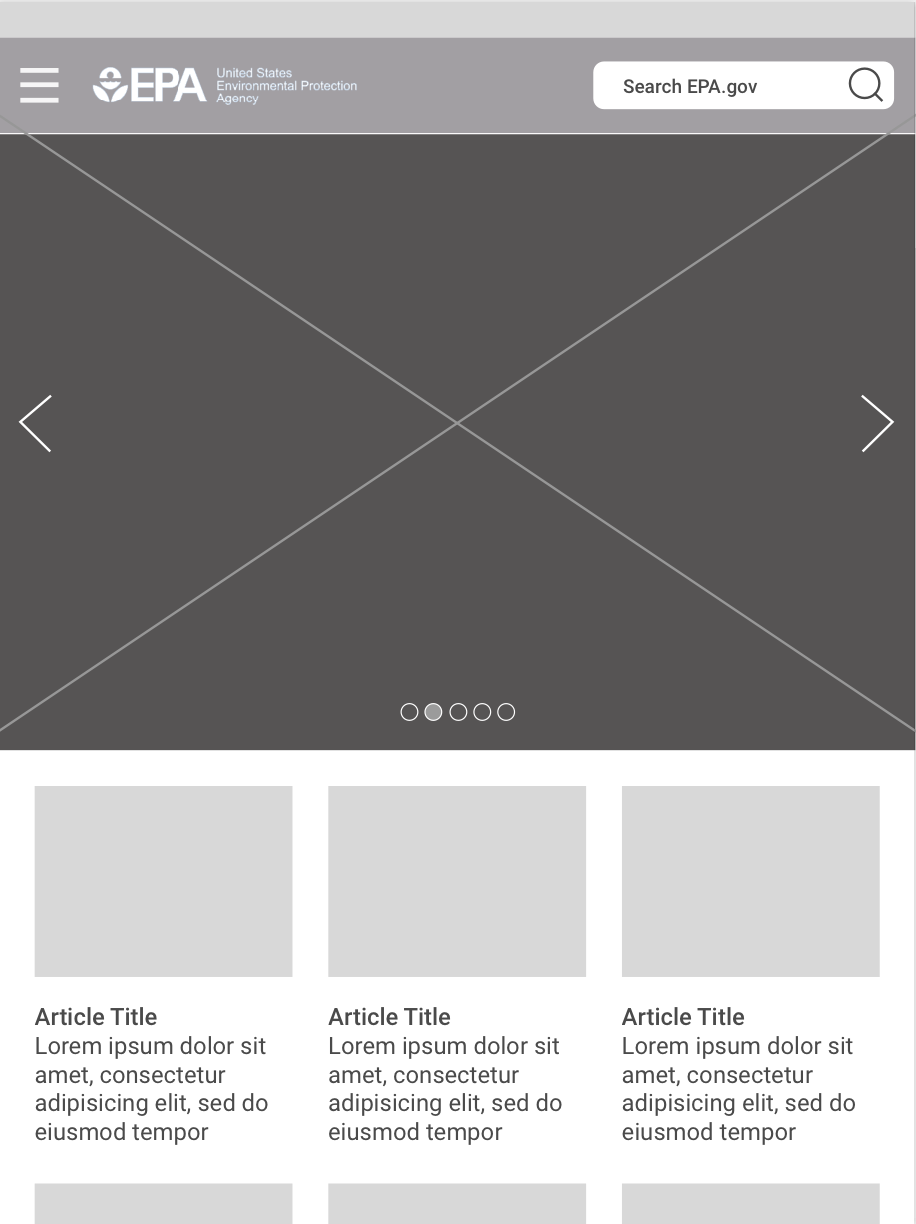
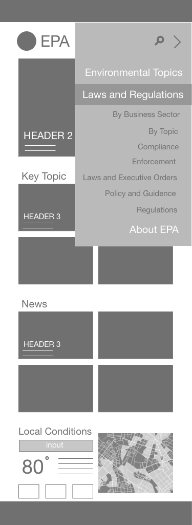
Based out on our research, survey results and analysis of the current design, we set out to enhance the user experience through new layout design. In this new design, we tried to isolate elements from the current layout and adding a user centered twist to make it more appealing to the user. This was achieved by
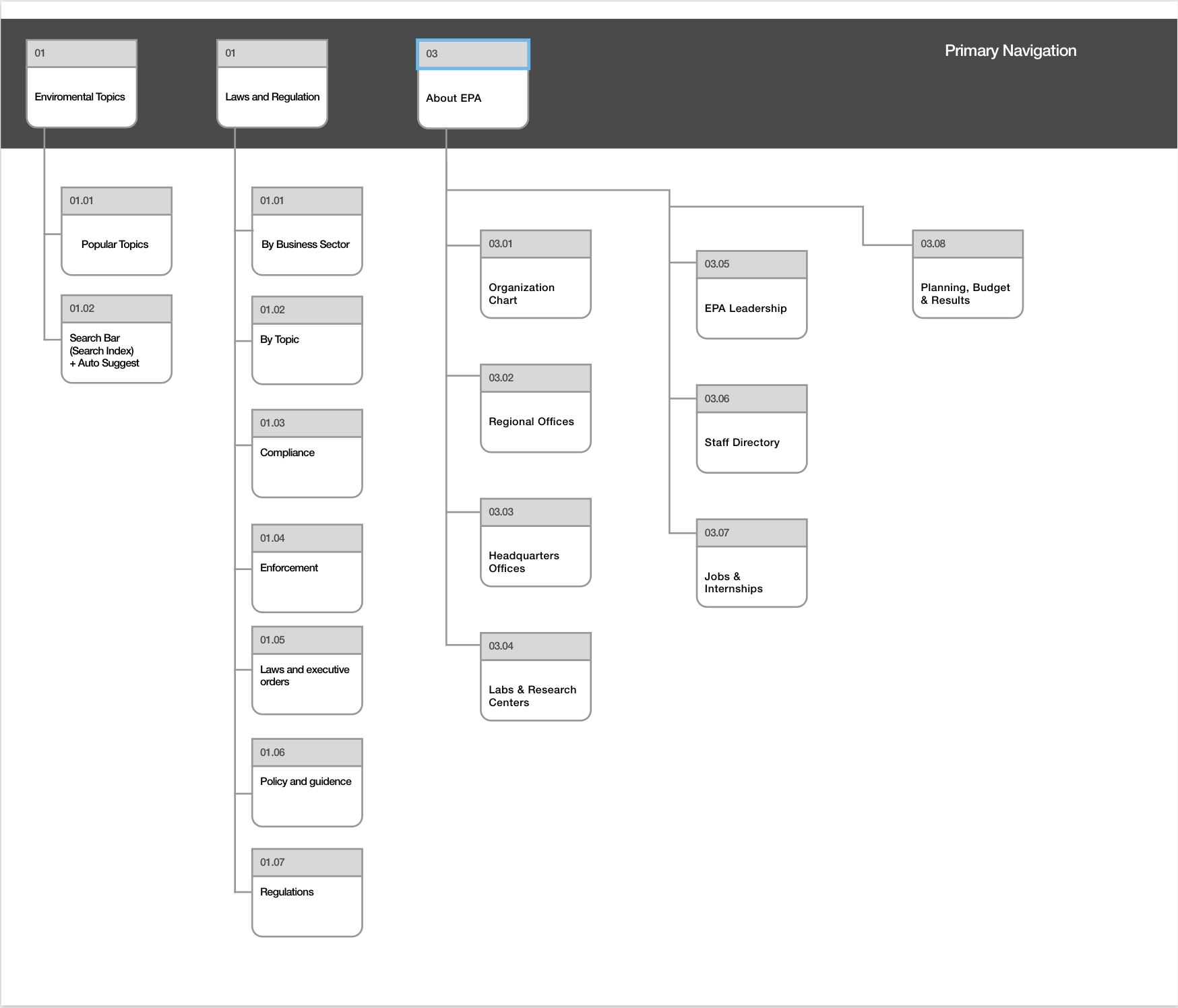
Taking advantage of the edge-to-edge real estate, by allowing for prioritization of content through introduction of hierarchies and by re-engineering the menu navigation to allow the user to get to their goal faster.
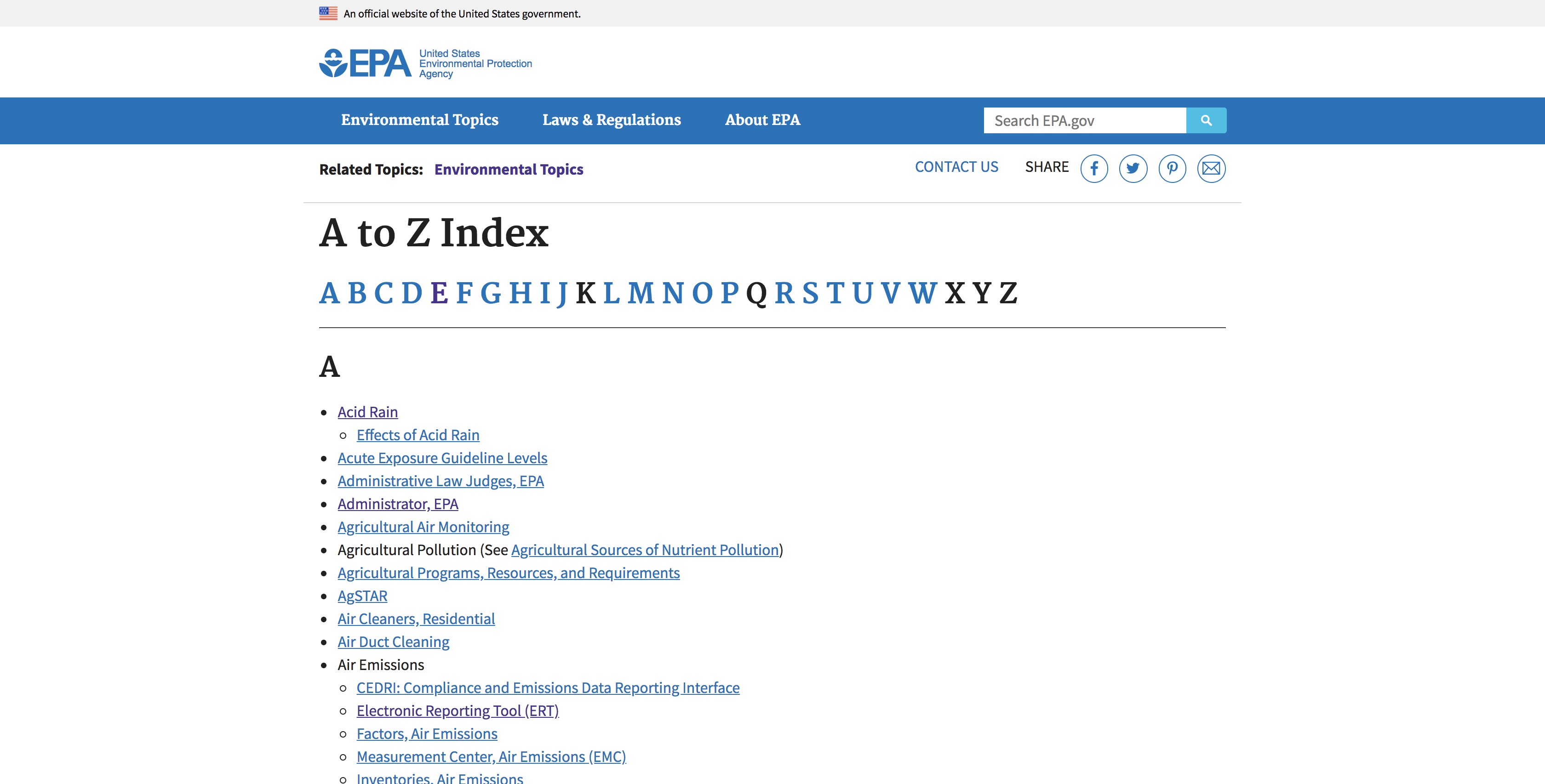
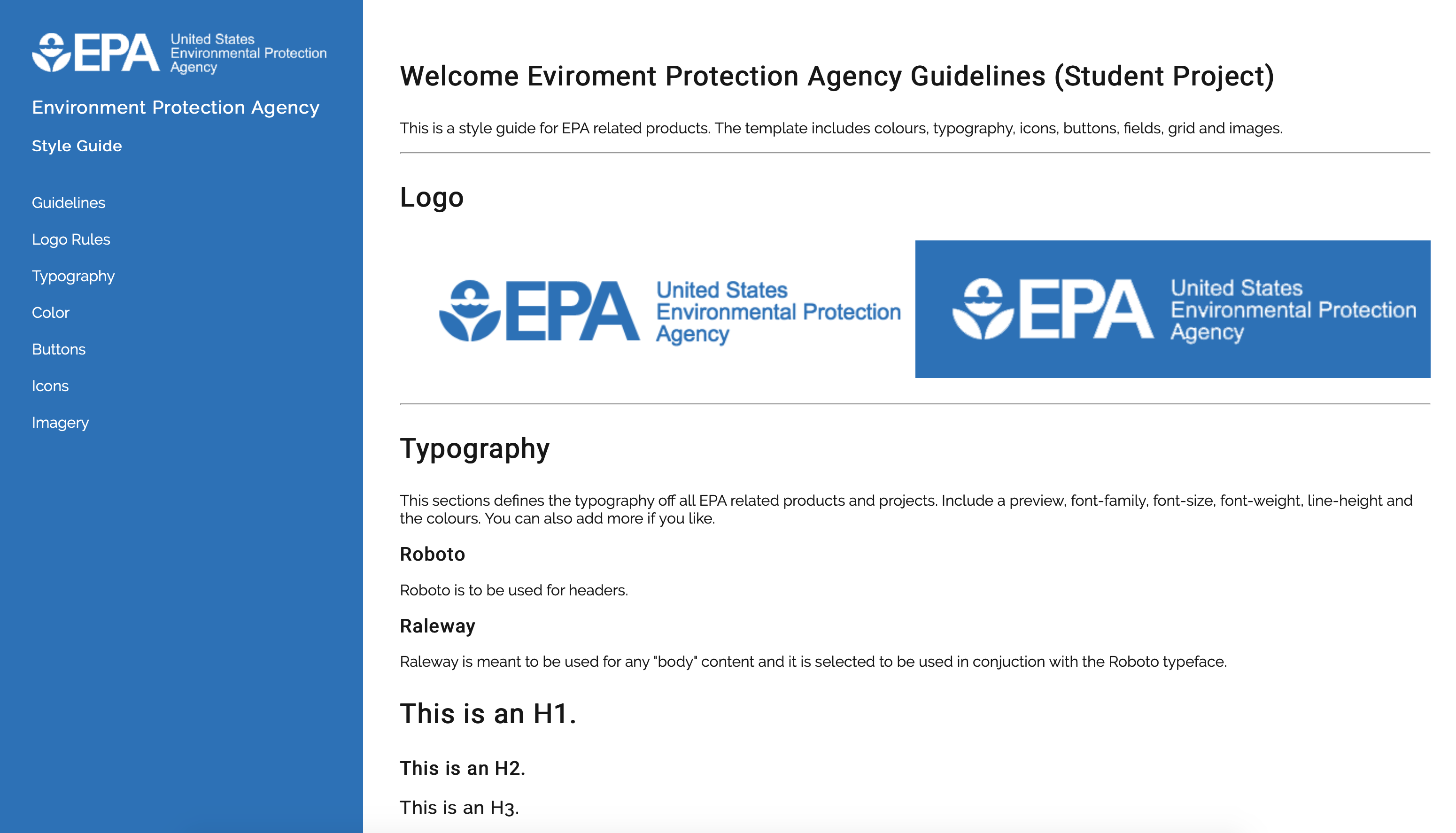
We spent hours studying the existing sitemap to remove redundancies and to minimize the categories to allow for a smoother navigation. Once completed, we started the process of re-design by looking for inspiration on the web. We looked for successful examples that aligned with our research had called out for, minimal and clean. This process sparked idea that allowed us to create an entirely new style guide which consisted of new type faces, color palettes, logo guidelines, buttons, icons and even the type of imagery to be used on the revamped page.




 © 2018
 ©2018 Apple Inc.